
| 일 | 월 | 화 | 수 | 목 | 금 | 토 |
|---|---|---|---|---|---|---|
| 1 | 2 | 3 | 4 | |||
| 5 | 6 | 7 | 8 | 9 | 10 | 11 |
| 12 | 13 | 14 | 15 | 16 | 17 | 18 |
| 19 | 20 | 21 | 22 | 23 | 24 | 25 |
| 26 | 27 | 28 | 29 | 30 | 31 |
- 단축키
- 업캐스팅
- 야구게임
- 로또
- 가변인자
- Login with OAuth Authentication
- 자바
- while
- 자바 야구게임
- 상속
- full text indexing
- Validations
- 전체텍스트
- Full text
- angular2
- 상속예제
- 이클립스
- 전체
- 페이징
- 다형성
- jquery
- 전자정부
- 다운캐스팅
- IBatis procedure
- Random
- 추상클래스
- 스프링
- 25가지 효율적인 sql작성법
- 형변환
- Today
- Total
nalaolla
코틀린 프로젝트 - 02 - 1단계: 기본적인 설계와 화면 구성 본문
소프트웨어 개발의 패턴과 관련 라이브러리 소개가 끝났으니 이제 본격적으로 안드로이드 앱을 한 단계씩 진행해 볼 차례입니다. 이 프로젝트는 지금까지 배운 모든 기법을 설명할 수는 없지만 다양한 서드파티 라이브러리와 코틀린을 통해 앱을 개발할 수 있는 가이드를 제시하고 설명할 것입니다. 이 앱을 만들고 분석하고 나면 기본적인 앱의 구성과 코틀린을 복습할 수 있게 됩니다. 더 나아가 직접 새로운 기능을 확장하고 오픈 API와 같은 데이터 서비스를 통해 다양한 앱을 개발할 수 있게 됩니다.
1단계: 기본적인 설계와 화면 구성
이 앱을 이용해 최근 영화 목록을 themoviedb.org 사이트로부터 JSON으로 받아와 제목, 이미지, 추천수 등을 안드로이드의 RecyclerView 를 통해 보여주도록 하는 앱 입니다. RecyclerView 의 목록은 infinite scroll을 이용해 끌어 올리면 끊임없이 뉴스 목록을 갱신하도록 하고 각 아이템은 CardView를 통해 나타냅니다.
프로젝트 생성과 빌드 시스템
1. 프로젝트 생성화면의 첫 화면은 Create New Project 입니다. 여기서 빈 프로젝트를 위해 (Empty Project)를 선택합니다.

Empty Activity의 선택
2. 이번에는 프로젝트 이름(Name)과 패키지 이름(Package name)을 정해 줍니다. 생성 위치(Save location)와 언어(Language)는 기본값이 지정되어 계정 하위, Kotlin으로 기본 지정되어 있습니다.

Caption
3. Minimum API level은 업데이트되지 않은 안드로이드를 지원하기 위해 최소 API레벨을 지정할 수 있습니다. 글 작성 기준의 95.3%가 대략 사용되고 있는 API 19을 선택 하겠습니다. 이제 Finish 버튼을 누르고 새로운 프로젝트를 생성합니다.
Tip:API레벨이 낮으면 그만큼 많은 기기를 지원하지만 너무 낮추면 API 사용성이 떨어질 수 있습니다. 적정 기준을 선택합니다.
잠시 시간이 지나면 새로운 프로젝트의 빌드가 완료되고 이제 몇 가지 파일을 생성/수정할 차례입니다.
4. 생성된 프로젝트의 build.gradle(Project: TheMovieApp) 파일을 열고 다음과 같이 추가 수정합니다.
| 프로젝트의 빌드 스크립트 | build.gradle |
buildscript { ext.kotlin_version = '1.3.50' ext.anko_version = '0.10.8' repositories { google() jcenter() } dependencies { classpath 'com.android.tools.build:gradle:3.5.0' classpath "org.jetbrains.kotlin:kotlin-gradle-plugin:$kotlin_version" ... buildscript {
Tip:버전의 선택
글 작성 기준으로 코틀린은 1.3.50을 사용하고 있는데 1.3.x 와 같이 버전이 마이너 업데이트를 통해 증가하고 있으므로 가장 최신 버전을 지정해 봅시다. 가끔 버전에 따라 API가 약간씩 달라지므로 항상 버전을 확인해 이상이 없는 버전을 잘 기록해 둡니다.
5. 모듈의 build.gradle(Module: App) 파일은 다음과 같이 코틀린의 버전과 Anko의 버전에 따른 의존성 라이브러리를 추가합니다. 각 라이브러리의 버전은 달라질 수 있습니다.
| 모듈의 빌드 스크립트 | build.gradle |
apply plugin: 'com.android.application' apply plugin: 'kotlin-android' apply plugin: 'kotlin-android-extensions' android { compileSdkVersion 29 buildToolsVersion "29.0.2" defaultConfig { applicationId "com.acaroom.themovieapp" minSdkVersion 19 targetSdkVersion 29 versionCode 1 versionName "1.0" ... dependencies { implementation fileTree(dir: 'libs', include: ['*.jar']) implementation"org.jetbrains.kotlin:kotlin-stdlib-jdk7:$kotlin_version" // 버전 확인 -jdk7 또는 -jdk8 implementation 'androidx.appcompat:appcompat:1.1.0' implementation 'androidx.core:core-ktx:1.1.0' implementation 'androidx.constraintlayout:constraintlayout:1.1.3' implementation 'androidx.cardview:cardview:1.0.0' // cardview의 추가 implementation 'com.google.android.material:material:1.0.0' // Toolbar, AppBar등을 사용하기 위한 androidX추가 라이브러리 ... }
간혹 다음과 같이 음영처리된 라이브러리는 최근 버전이 있다는 표시입니다. Alt + Enter 키를 누르고 최근 버전으로 변경할 수 있습니다. 이 때 간혹 API가 달라지는 경우가 있으니 잘 동작하지 않을때는 기존의 버전으로 돌려놓기 위해 코멘트에 이전버전을 꼭 명시하기 바랍니다.

Alt + Enter키를 누르고 최근 버전으로 변경하기
androidX 라이브러리
안드로이드 버전 10인 Android Q는 API레벨이 29로 올라갔습니다. 하위 호환성을 위해 CardView와 같은 기존에 유지되던 안드로이드 지원 v7의 라이브러리는 API버전 28까지만 사용할 수 있습니다. 따라서 Android Q버전에서는 API 28 이상이 되므로 AndroidX 라이브러리로 마이그레이션 해야 합니다. 만일 기존의 프로젝트가 있다면 Refactor > Migrate 메뉴를 통해서 변경할 수 있습니다. 그리고 gradle.properties파일에 다음과 같은 설정이 true로 지정되어 있어야 합니다. 이 프로젝트 예제에서는 AndroidX를 사용하도록 하겠습니다.
android.useAndroidX=true ... android.enableJetifier=true
기본 화면 디자인
화면 디자인을 위한 스케치를 하고 계획을 잡아 봅니다. 각각의 레이아웃 요소와 필요한 뷰를 정리해 보겠습니다.

화면 디자인과 뷰의 요소의 정리
먼저 기본 Activity에 FrameLayout을 배치하고 이곳을 Fragment로 교체 하는 방식으로 배치할 것입니다. Fragment에는 RecyclerView가 놓여질 것이고 RecyclerView의 각 아이템은 영화 정보와 진행을 나타내는 두가지 뷰 자료형을 사용할 것입니다.
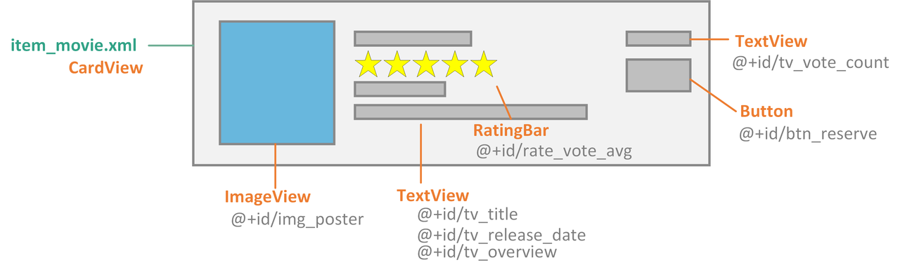
영화 정보를 위한 아이템
영화 정보는 item_movie.xml에서 이미지, 설명, 작성자, 추천수, 출시된 날짜 등을 위해 ImageView와 TextView를 활용해 배치하도록 합니다. RecyclerView를 위로 스크롤 하면 데이터의 제일 마지막은 ProgressBar를 가지는 로딩 아이템 뷰로 배치하도록 합니다. 새로운 뉴스 컨텐츠가 로드 되면 다시 뉴스 아이템으로 채워집니다.
먼저 기본 생성된 레이아웃 파일에서 최상위 태그를 CoordinatorLayout으로 바꿔 보도록 하겠습니다.
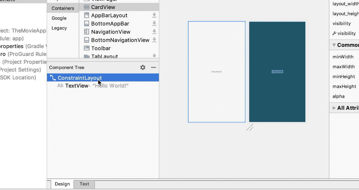
기본레이아웃의 변경
위와 같이 변경하면 기본 레이아웃이 변경됩니다. 이후 다음과 같이 소스를 변경해 봅시다.
1. 그러면 res/layout/activity_main.xml부터 주요 설계 소스 부분을 채워 보겠습니다. 위의 그림과 비교하면서 xml 레이아웃을 추가/수정합니다.
| 메인 화면의 구성 | activity_main.xml |
<?xml version="1.0" encoding="utf-8"?> <androidx.coordinatorlayout.widget.CoordinatorLayout xmlns:android="http://schemas.android.com/apk/res/android" xmlns:app="http://schemas.android.com/apk/res-auto" xmlns:tools="http://schemas.android.com/tools" android:layout_width="match_parent" android:layout_height="match_parent" tools:context=".MainActivity"> <com.google.android.material.appbar.AppBarLayout android:layout_width="match_parent" android:layout_height="wrap_content" > <androidx.appcompat.widget.Toolbar android:id="@+id/toolbar" android:layout_width="match_parent" android:layout_height="?attr/actionBarSize" android:background="?attr/colorPrimary" /> </com.google.android.material.appbar.AppBarLayout> <FrameLayout android:id="@+id/base_content" app:layout_behavior="@string/appbar_scrolling_view_behavior" android:layout_width="match_parent" android:layout_height="match_parent"> </FrameLayout> </androidx.coordinatorlayout.widget.CoordinatorLayout>
activity_main.xml에는 <AppBarLayout>과 <Toolbar>가 정의되어 있는데 기존의 <include>태그를 삭제하고 id인 base_content의 <Framelayout>을 추가합니다. 이것은 향후 Fragment로 교체될 것입니다. 기존의 content_main.xml과 같은 파일이 있다면 필요 없으므로 삭제합니다.
2. 프로젝트창의 res/layout/ 에서 Alt +Insert (MAC: control + return )키를 누르고 [Layout resource file]을 선택한 후 다음과 같이 frag_recycler.xml를 추가 및 설정합니다.
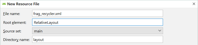
새로운 레이아웃 frag_recycler.xml의 추가
이제 만들어진 레이아웃에 다음과 같이 RecylerView를 드래그앤드롭으로 배치하거나 fag_recycler.xml에서 직접 코딩합니다.
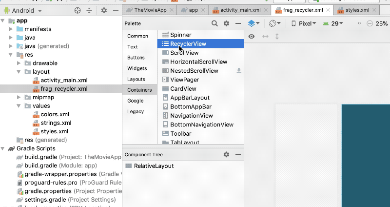
RecyclerView 배치하기
| 새로운 레이아웃의 추가 | frag_recycler.xml |
<?xml version="1.0" encoding="utf-8"?> <RelativeLayout xmlns:android="http://schemas.android.com/apk/res/android" android:layout_width="match_parent" android:layout_height="match_parent"> <androidx.recyclerview.widget.RecyclerView android:id="@+id/rv_news_list" android:layout_width="match_parent" android:layout_height="match_parent" /> </RelativeLayout>
news_list라는 id를 가진 <RecyclerView> 태그를 정의하였습니다. 안드로이드 하위 호환성을 위해 지원 라이브러리 버전7을 통해 구성됩니다.
3. 이번에서 새로운 레이아웃 item_movie.xml을 위와 같은 방법으로 res/layout/에 추가합니다. 이번에는 상위 요소(Root element)로 CardView를 지정합니다.
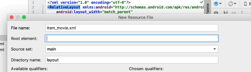
CardView의 지정
그다음 레이아웃 소스를 다음과 같이 작성합니다.
| 아이템을 위한 레이아웃 추가 | item_movie.xml |
<?xml version="1.0" encoding="utf-8"?> <androidx.cardview.widget.CardView xmlns:android="http://schemas.android.com/apk/res/android" android:layout_width="match_parent" android:layout_height="160dp" android:layout_margin="5dp" android:layout_marginTop="10dp" android:elevation="4dp"> <LinearLayout android:layout_width="match_parent" android:layout_height="match_parent" android:background="?attr/selectableItemBackground" android:orientation="horizontal" android:padding="10dp"> <ImageView android:id="@+id/img_poster" android:layout_width="100dp" android:layout_height="match_parent" android:scaleType="centerCrop" /> <LinearLayout android:layout_width="0dp" android:layout_height="match_parent" android:layout_marginLeft="10dp" android:layout_weight="1" android:orientation="vertical"> <TextView android:id="@+id/tv_title" android:layout_width="wrap_content" android:layout_height="wrap_content" android:text="Title" android:textColor="#000000" android:textSize="17sp" android:textStyle="bold" /> <RatingBar android:id="@+id/rate_vote_avg" style="@style/Widget.AppCompat.RatingBar.Small" android:layout_width="wrap_content" android:layout_height="wrap_content" android:layout_marginTop="5dp" android:isIndicator="true" android:numStars="5" android:progressTint="@color/colorRateMovie" android:rating="1.5" android:stepSize="0.5" /> <TextView android:id="@+id/tv_release_date" style="@style/screen_text" android:text="개봉일: 2018-01-01" /> <TextView android:id="@+id/tv_overview" style="@style/screen_text" android:text="영화 설명을 나타냅니다." /> </LinearLayout> <LinearLayout android:layout_width="70dp" android:layout_height="match_parent" android:gravity="center_horizontal" android:orientation="vertical"> <TextView android:id="@+id/tv_vote_count" android:layout_width="wrap_content" android:layout_height="wrap_content" android:layout_marginTop="20dp" android:text="투표수" android:textColor="@color/colorVoteCount" android:textSize="10sp" /> <Button android:id="@+id/btn_reserve" android:layout_width="60dp" android:layout_height="30dp" android:layout_marginTop="5dp" android:background="@drawable/shape_btn_movie" android:text="예매" android:textColor="@color/colorVoteCount" android:textSize="12sp" /> </LinearLayout> </LinearLayout> </androidx.cardview.widget.CardView>
RecyclerView에서 하나의 item으로 사용할 레이아웃입니다. <CardView>에 <LinearLayout>을 적당히 추가 배치해 구성합니다. 여기에 사용된 color와 style, drawable은 아직 구성되지 않아 붉은색으로 표시됩니다. 추가로 만들어 봅시다.
4. 먼저 res/values/의 colors.xml에 색상을 추가합니다.
| 색상의 추가 | colors.xml |
<?xml version="1.0" encoding="utf-8"?> <resources> <color name="colorPrimary">#008577</color> <color name="colorPrimaryDark">#00574B</color> <color name="colorAccent">#D81B60</color> <color name="colorRateMovie">#ffb300</color> <color name="colorVoteCount">#ff4081</color> </resources>
5. 그 다음 tv_release_date와 tv_overview에 사용할 텍스트의 스타일을 지정하기 위해 res/values/의 styles.xml 파일에 다음을 추가합니다.
| screen_text 스타일 추가 | styles.xml |
... <style name="screen_text"> <item name="android:layout_width">wrap_content</item> <item name="android:layout_height">wrap_content</item> <item name="android:layout_marginLeft">5dp</item> <item name="android:layout_marginTop">5dp</item> <item name="android:textSize">12sp</item> <item name="android:textColor">#666666</item> <item name="android:ellipsize">end</item> <item name="android:maxLines">4</item> </style> </resources>
6. <shape>태그를 사용해 버튼 모양을 내도록 res/drawable/에 shape_btn_movie.xml파일을 추가합니다.
| 버튼 모양의 shape 추가 | shape_btn_movie.xml |
<?xml version="1.0" encoding="utf-8"?> <shape xmlns:android="http://schemas.android.com/apk/res/android"> <stroke android:color="@color/colorAccent" android:width="1dp" /> <gradient android:endColor="#ffffff" android:startColor="#ffcdcd" android:angle="90" /> <corners android:radius="2dp"/> </shape>
이제 item_movie.xml로 돌아와 보면 대략 다음과 같은 모양이 완성 되었습니다.

item_moive의 레이아웃
7. 이제 마지막으로 로딩하는 아이템을 위한 item_loading.xml은 res/layout/에 다음과 같이 구성합니다.
| 로딩 레이아웃 | res/layout/item_loading.xml |
<?xml version="1.0" encoding="utf-8"?> <LinearLayout xmlns:android="http://schemas.android.com/apk/res/android" android:layout_width="match_parent" android:layout_height="wrap_content" android:layout_margin="20dp" android:gravity="center_horizontal" android:orientation="horizontal"> <ProgressBar android:id="@+id/progress" android:layout_width="40dp" android:layout_height="40dp" /> </LinearLayout>
이제 XML을 통한 기본적인 화면이 구성되었습니다. 이것을 Anko로 구성할 수도 있지만 먼저 XML을 통해서 구성했습니다. 사용자에게 직접 보이는 부분이기 때문에 예쁘고 실용적으로 구성해야 합니다. 구성된 레이아웃에 뿌려줄 아이템이 아직 없어 확인하기 어렵습니다.
소스관리를 위한 저장소 구성하기
소스관리와 추적을 위해서 Git 저장소를 구성해 보겠습니다. 다음과 같이 VCS > Enable Version Control Integreation... 메뉴를 누르고 로컬 저장소를 활성화 합니다.
물론 Git 명령형 도구도 사용될 수 있으므로 미리 설치해 둡니다. 이제 원격 저장소도 사용하기 위해 Android Studio의 설정 화면에서 다음과 같이 계정을 추가할 것입니다.
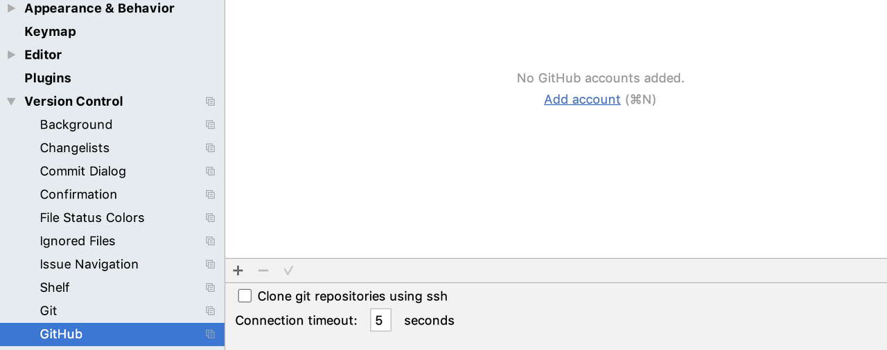
설정 메뉴의 GitHub 설정
Tip:설정메뉴(Setting 또는 Preferences) 열기 - 윈도우: Ctrl + Shift + S , 맥: command + ,
설정 메뉴의 Version Control > GitHub에서 Add account를 선택하고 자신의 계정 설정을 추가합니다. 물론 GitHub의 계정이 아직 없다면 만들어 주어야합니다.
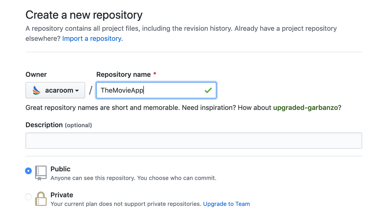
GitHub에서 새 원격 저장소를 만들게 되면 다음과 같이 URL을 얻을 수 있습니다.

HTTPS 혹은 SSH프로토콜의 주소를 얻을 수 있습니다. 이 주소를 복사해 Android Studio 에서 해당 프로젝트에 설정할 것입니다.
이제 Android Studio에 VCS > Git > Remotes...메뉴를 누르고 다음과 같이 복사한 원격 저장소 위치를 지정해 줍니다.

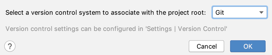
이제 저장소 설정이 끝났습니다. 지금까지 만든 내용을 커밋(commit)합니다. VCS > Commit...메뉴를 누르면 다음과 같은 화면이 나오는데 아직 프로젝트가 초기 상태이므로 Perform code analysis나 Check TODO 체크박스는 해제합니다.

문제가 없다면 Commit Message에 Initial Project라는 메시지를 기록하고 Commit버튼을 누릅니다. 커밋이 완료되면 로컬 저장소에 소스가 커밋되며 이제 추적 관리 상태에 놓여지게 됩니다.
원격 저장소에도 반영하기 위해서는 VCS > Git > Push 를 차례로 찾아서 누릅니다. 설정된 저장소에 소스가 반영될 것입니다.
Tip: 커밋 및 푸시(Commit, Push)
이제 각 단계별로 소스를 로컬에 반영하기 위해 커밋하고 원격 저장소 반영을 위해 푸시를 진행할 것입니다. 단축키를 알아두면 편리합니다.
- 커밋 - 윈도우: Ctrl + K , 맥: command + K
- 푸시 - 윈도우: Ctrl + Shift + K , 맥: shift + command + K
이제 첫 단계가 끝났습니다. 다음 단계에서 다시 진행하겠습니다!
'DEV' 카테고리의 다른 글
| Docker + Spring Boot examples (0) | 2020.03.02 |
|---|---|
| 스프링 부트 도커에 올리기(Dockerizing Spring Boot App) (0) | 2020.02.28 |
| thumbor+varnish를 이용한 이미지 처리 서버(thumbnail server) 구축 (0) | 2020.02.19 |
| 소나큐브(Sonarqube)를 통한 코드 분석 및 코드 품질 향상 (0) | 2020.02.19 |


